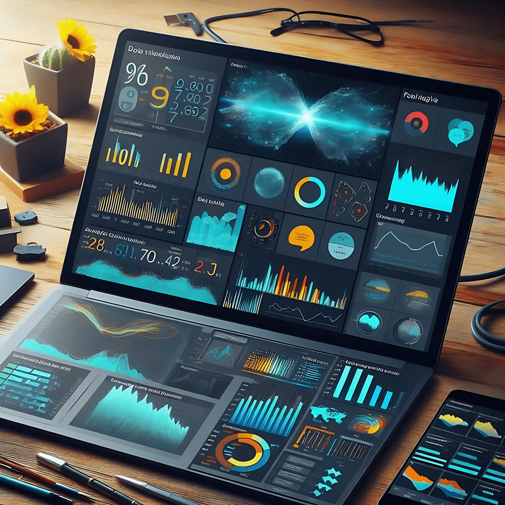
The purpose of creating dashboards is to provide an efficient solution for organizing data.
Dashboards enable clear and effective use of data; however, not every dashboard achieves this goal.
Only those designed according to business intelligence dashboard design principles can truly drive efficiency and insight within an organization.
In fact, dashboards that do not follow these principles lack a clear purpose.
As a result, they fail to deliver any meaningful impact or positive performance within the system.
To ensure that the dashboards you create are effective, it’s enough to follow the essential design principles.
Why Dashboard Design Principles Matter in Business Intelligence?
As we know, data plays a crucial role in the business world, and most decisions today are data-driven.
Now, imagine a manager who needs access to specific data in order to make an important decision.
When this data is not presented in a clear and organized way, the manager will undoubtedly struggle to make the best decision in the shortest possible time.
This is where the importance of a well-designed dashboard becomes evident.
If a dashboard follows the fundamental design principles, it will present data to users in a clear and comprehensive way.
As a result, users will be able to analyze the information quickly and efficiently.
Keep in mind that many data visualizations are created primarily to track Key Performance Indicators (KPIs).
Therefore, it is crucial how this data is presented to ensure clarity and effective decision-making.
On the other hand, imagine that the data is presented perfectly and according to best practices, but the user cannot scan or interpret it quickly.
In that case, the data becomes practically useless to the user.
A dashboard that fails to deliver information in a meaningful and accessible way reflects poor design.

Key Elements of Dashboard Design
-
Clear Purpose and Target Audience (Defining the Goal)
Before starting the design process, you need to clearly define the main purpose of the dashboard and identify the key questions it is intended to answer.
Is the dashboard designed for performance monitoring, or is it meant for in-depth data analysis?
Identify the audience: consider the knowledge level and needs of the primary users.
A dashboard should be designed to match the abilities and requirements of the people who will actually use it. -
Selecting the Right KPIs:
Selecting the Right KPIs:
Key Performance Indicators (KPIs) should be directly aligned with organizational goals and management decisions.
Having too many or overly complex KPIs can cause confusion, so it’s important to focus only on those that are essential and meaningful. -
Data Organization (Information Categorization):
The dashboard should organize information logically and divide it into clear sections, allowing users to quickly find the most important data.
Prioritization: critical information should be placed at the top or in more prominent areas of the dashboard for better visibility. -
Simplicity and Accessibility (Clean Design):
A dashboard should not be cluttered or overly complex.
Avoid using complicated graphics or unnecessary information.
Easy accessibility: users should be able to navigate smoothly and access the data they need through clear and intuitive navigation tools. -
Effective Data Visualization (Appropriate Charts and Graphs):
Use charts that match the type of data being presented.
For example, pie charts are suitable for showing proportions, while line charts are ideal for displaying trends over time.
Colors and visual design: use colors appropriately and sparingly — darker tones for emphasis and neutral shades for backgrounds.
It’s also important to maintain a modern and user-friendly visual design to enhance clarity and engagement. -
Interactivity and Filters:
Interactivity and Filters:
The dashboard should allow users to filter information based on their needs.
Interactive features — such as selecting time ranges, grouping data, or applying categories — help users view and analyze the data from different perspectives. -
Automatic Updates and Synchronization (Real-Time Data):
The dashboard should use updated data regularly and within defined time intervals.
Automatic synchronization with main data sources is essential to ensure that users always have access to the most current and accurate information. -
Performance Measurement and Monitoring (Dashboard Evaluation):
After the design phase, the dashboard’s performance should be measured and monitored to ensure it meets user needs effectively.
Over time, adjustments and optimizations may be required to maintain its efficiency and relevance.
Perhaps the most appealing and fascinating part of
Business Intelligence (BI)
is data visualization.
While it may seem exciting and creative, data visualization is also a highly delicate task that can either undermine or enhance the performance of everyone involved in the BI process.
Since the end user ultimately interacts with the results through the designed dashboards, data visualization plays a critical role in determining how effectively insights are communicated and understood.


